Table of Contents
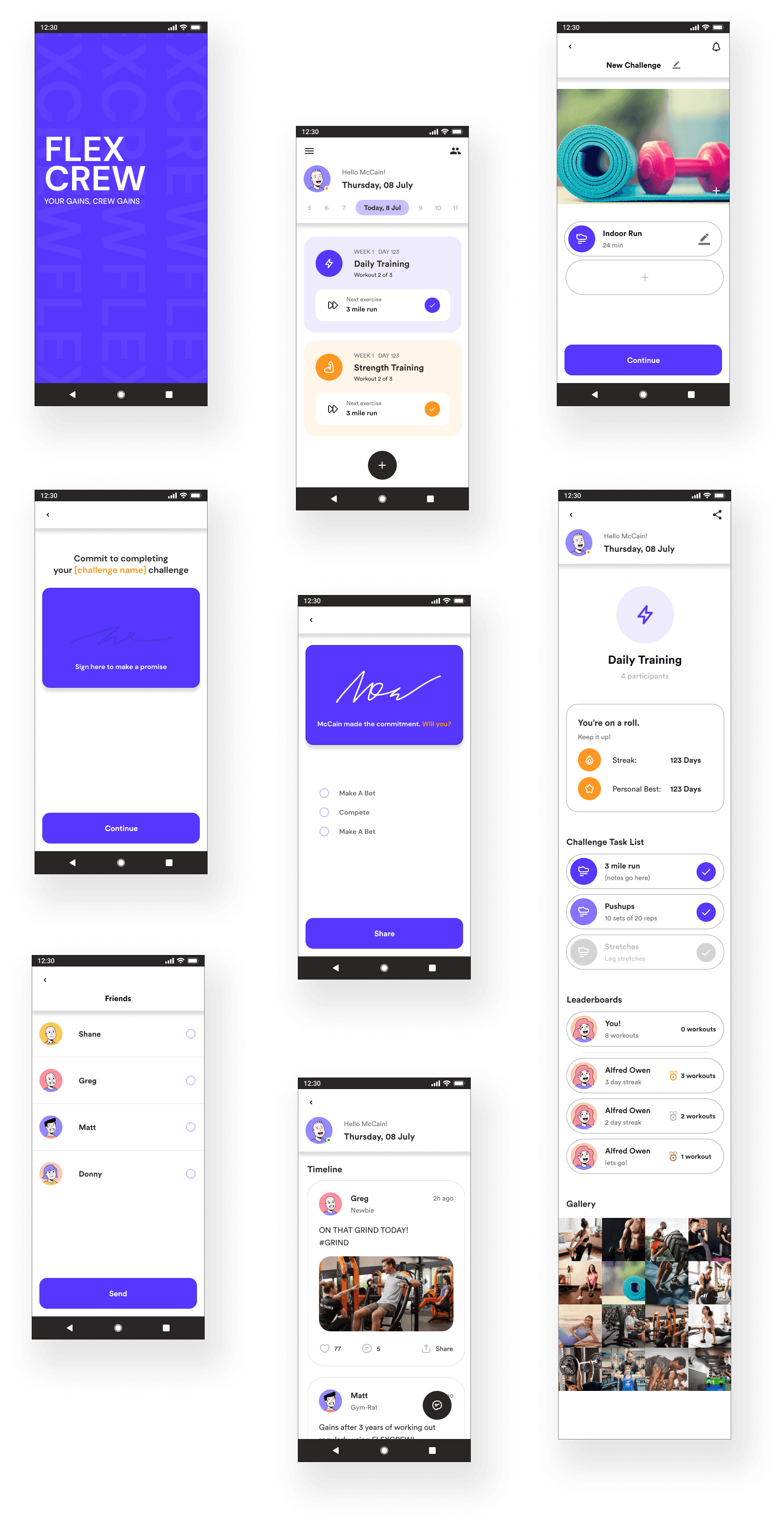
FLEXCREW is a family and friends health tracking app built for the mobile platform. The app allows users within a group to see how others within the group are doing regarding health & fitness.
The company brought me on to design new messaging features that create sustained engagement and activity.
The hypothesis is that if members of the family or group can message individuals or entire group at any point throughout the user experience, engagement and repeat usage will go up. With that in mind, The client specified that solutions must:
Create the opportunity for users to message each other with health and fitness goals/achievements.
Create an integrated messaging experience throughout the product that drives engagement and repeat usage.
Be designed for a mobile platform.
First Steps
To start, I checked out some other apps that fulfilled similar purposes to get a general idea of what kinds of solutions already exist and to see what worked or didn’t work for them.

Productive
Social, Lifestyle
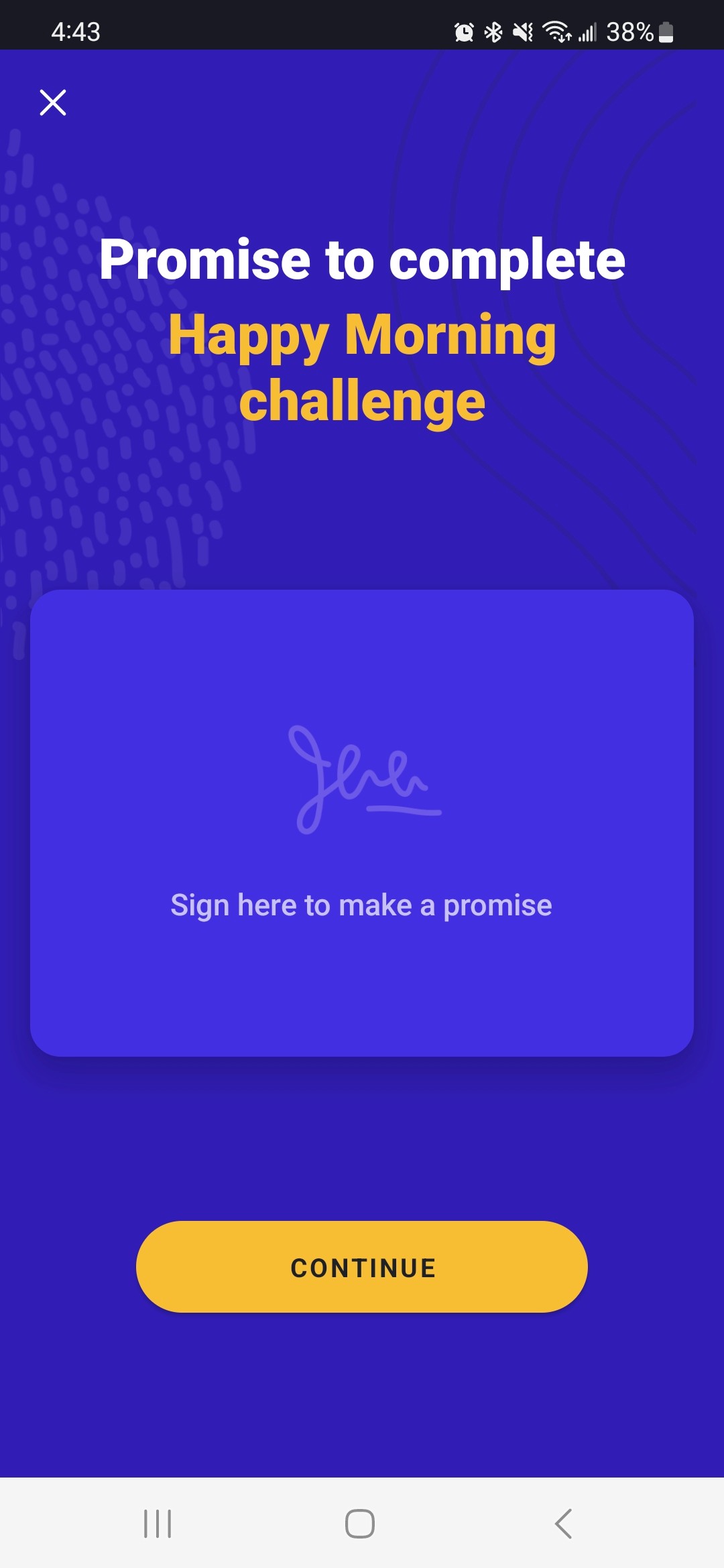
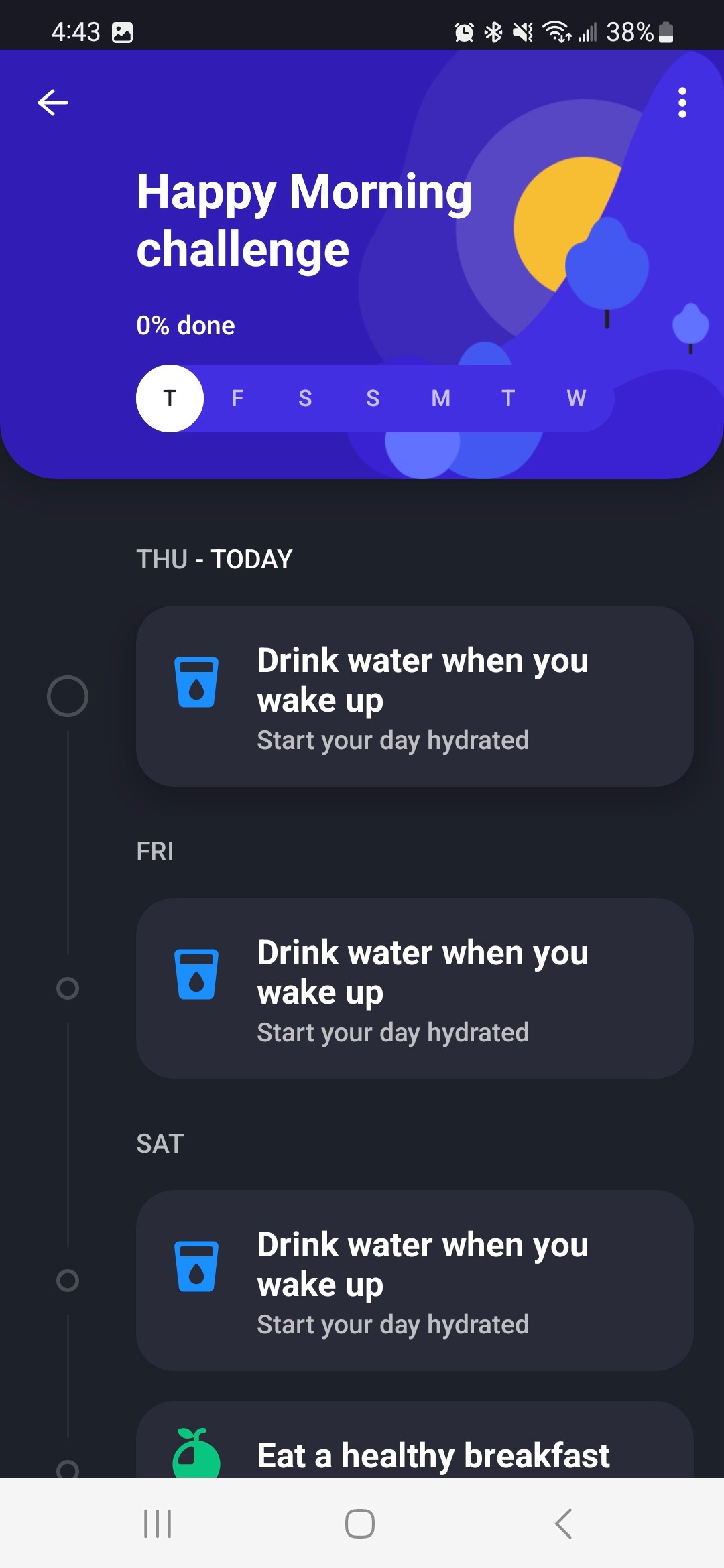
I started off with Productive, a lifestyle habit tracker. It was built around the calendar system and had a focus on streaks and maintaining habits.
When creating new tasks/habits you’re able to sign off on it as a “commitment” which I think is great.
Lists are clear and easy to understand
Easy to understand where in a process you are
Signing off your commitment feels amazing
UI can feel clunky and claustrophobic at times
User flows feel like a one way street; once you’re in, you’re pushed to finish

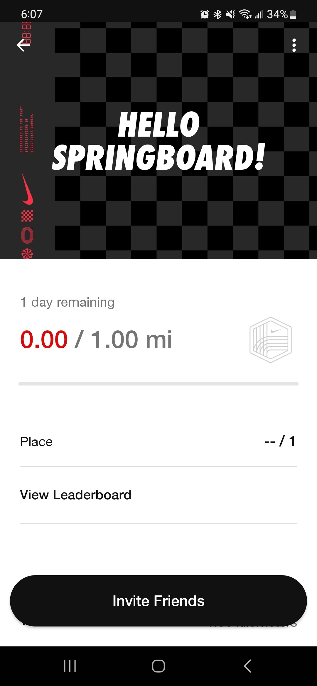
Nike Run Club
Social, Fitness
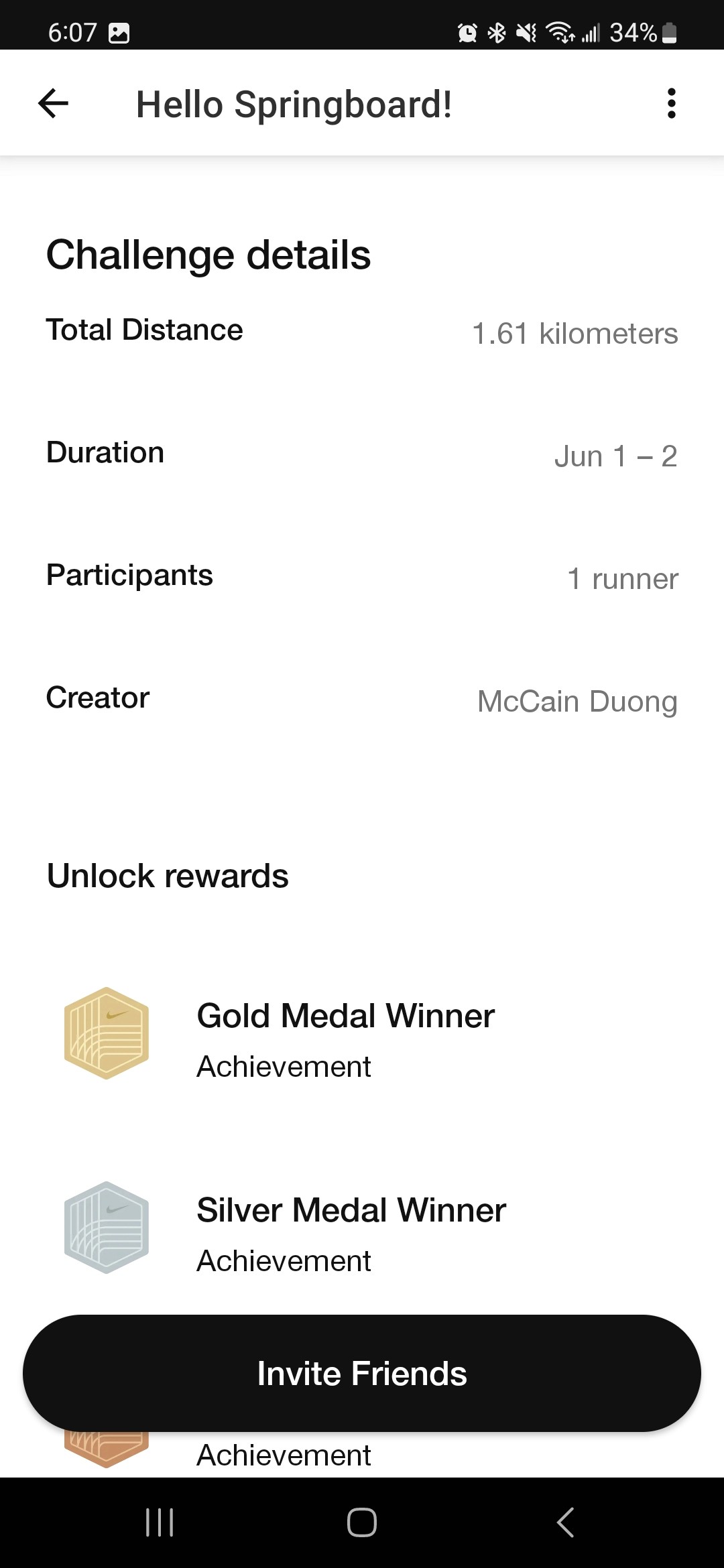
NRC was much more focused on fitness, specifically running. The UI felt clean and polished, achievements look fun. Social features are lacking, not much of an incentive to get friends and family in on it.
Simple & intuitive to use
UI feels breathable, information is clear
Achievements look fun to work for, progress is shown
Community/Social functions are a bit lacking
Tasks themselves don’t feel built with social aspects in mind

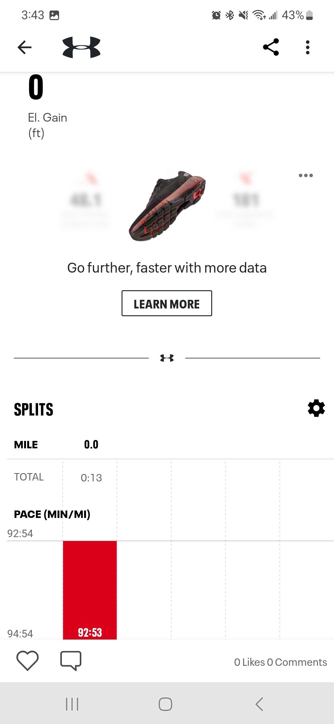
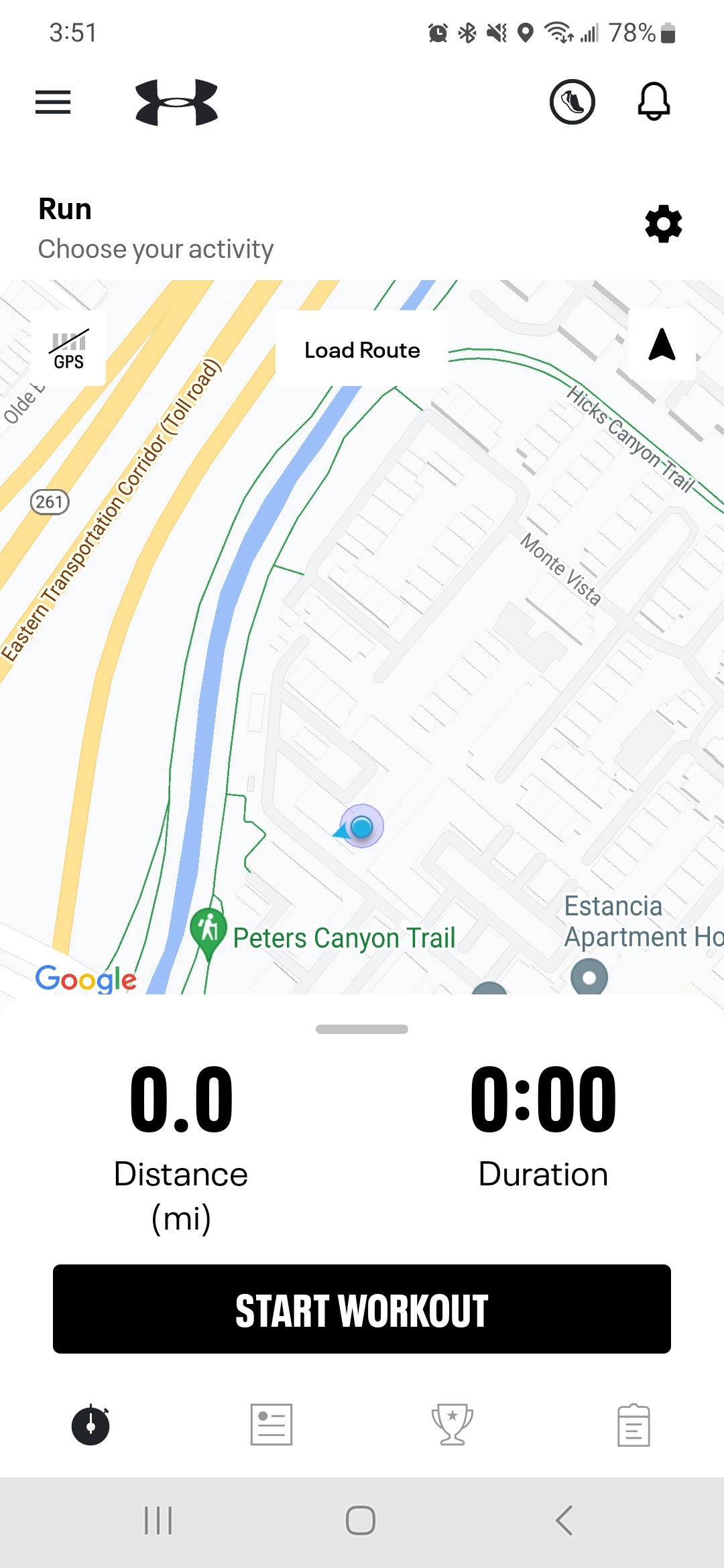
Map My Run
Social, Fitness
MMR fulfills much of the same purposes as NRC, with a couple of key differences. The app looks polished and relatively fleshed out. I did feel that the core screens of the social flows were a little tucked away, and the inbuilt prompts were a little bare.
Main user flow feels smooth and streamlined
Social functions feel incorporated into main flow
App feels fleshed out and balanced
Detailed social functions are tucked away and hard to reach
Lots of menus are hard to digest and understand
Altogether,
I was starting to get a general idea of what kind of app I wanted to put together. I made a short list of what kind of features/ideas stuck out to me so I could try them later when I’d be putting together designs.
Workout tracker/planner
References to time + routine
Checklists
Competition-related social features
Medals/Goals to strive for
Sign-off to commit
User Research
Next, I had to gather some actual user research to get a concrete and specific idea of what kind of solutions could fulfill FLEXCREW’s user needs.
I reached out to people I knew that fit the target demographic and sat down with them to understand their lifestyle, habits, motivations, and needs.
1.
Why do people share & pursue fitness goals?
2.
What stops people from using fitness apps consistently?
3.
What kinds of group activities do people participate in?
4.
What solutions currently exist? How do people currently track and share their pursuits?
I kept the interviews themselves freeform, using the questions I had drafted as a general list of topics to hit.
During and after each interview, I made note of the things that stuck out to me and the answers that they gave.
Afterwards, I went through and highlighted specific statements and points that I could act on.
Meet Jim
Using the interview notes as a base, I put together a user persona that I named Jim, along with a list of his motivations, lifestyle, and current gripes with his routine.
I would use Jim as a quick and effective reference for my design choices later down the line.
Wants to share his fitness goals to compete with friends
Wants to maintain current or new fitness habits to reach goals.
Regularly works out, invites and competes with friends.
Needs a quick and easy way to communicate goals to friends and family, as well as keep track of how they’re doing.
Worried about life getting in the way, breaking streaks and losing motivation.
Initial Sketch
I was starting to get a general idea of what kind of app I wanted to put together. I made a short list of what kind of features/ideas stuck out to me so I could try them later when I’d be putting together designs.
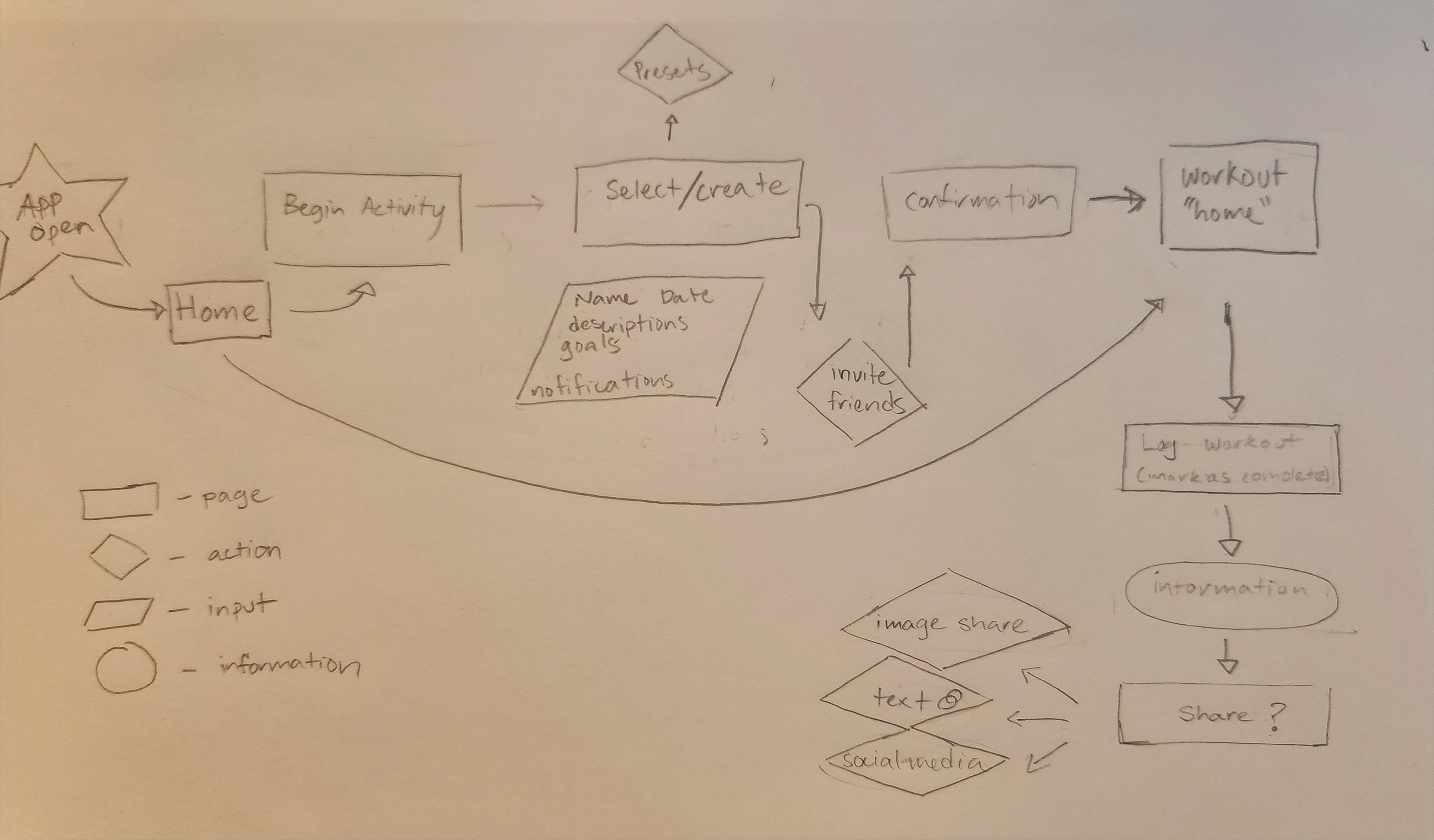
Sketches
My choice of low-fidelity medium would be a set of sketches that I would blow up to handheld size to hold user testing sessions with.
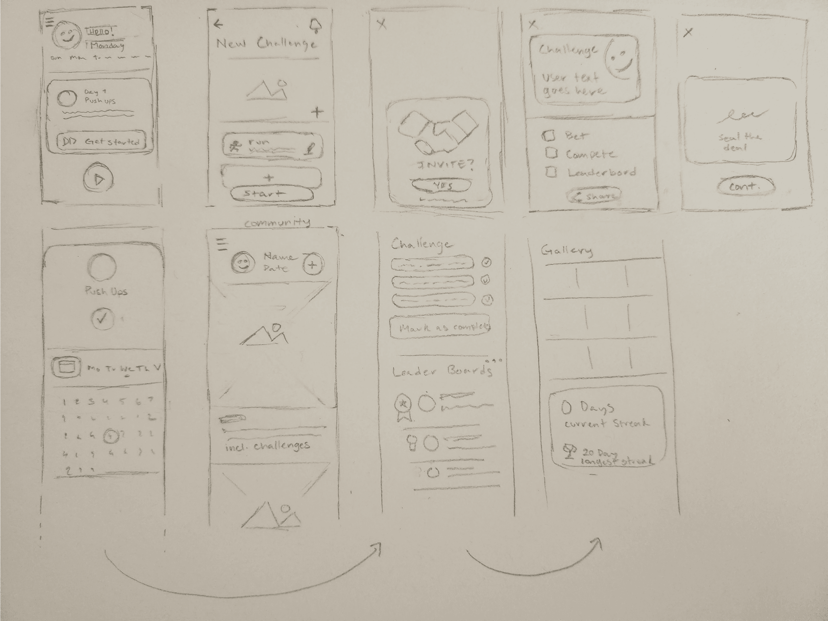
The general idea
of the app would be to act as a habit tracker, but with a fleshed out social system that would spur competition and engagement.
I borrowed some ideas from the secondary research that I did, since I felt that they’d help meet some of Jim’s needs. Having some kind of indicator of time passing (in this case, a calendar and daily streaks) would hopefully encourage users to check in regularly.
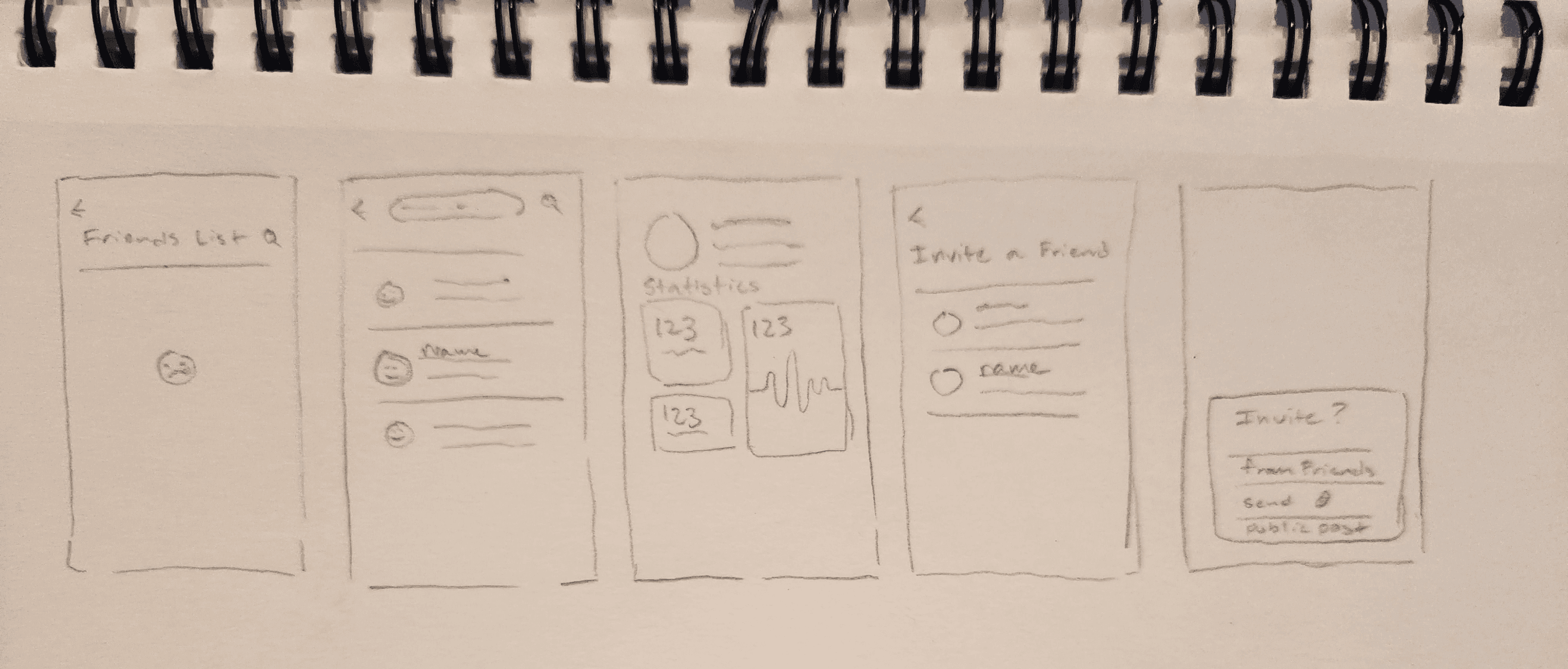
Before starting any hi-fi designs, I wanted to get some insight on how functional the sketches were before making any decisions that would be hard to undo.
I conducted my tests at a local coffee shop where I flagged down people, asking for a couple minutes to test the “app” in exchange for a couple of dollars to pay for their coffee. I tried to flag down people that fit my target demographic for best results.
I’d have them give me their thoughts of the screens themselves, and gave them a couple of tasks to do from a list that I had prepared beforehand.
Afterwards, I’d make note of any thing I thought was interesting and any snags that they’d run into.
I distilled the content of the interviews down to a report that had the findings, insights, and actionable tasks for me in one place.
With the report in hand, I got to work on the high-fidelity prototypes.
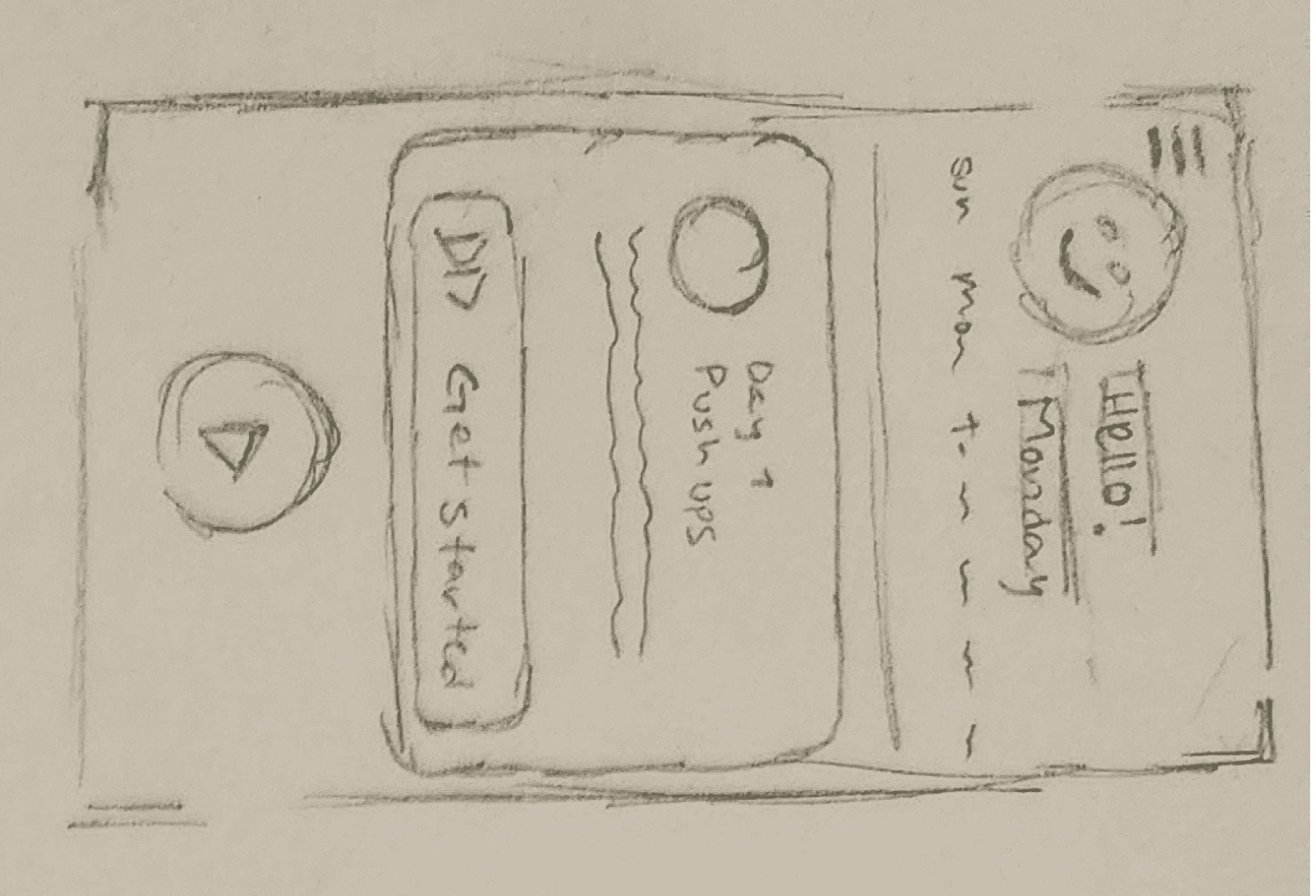
With the sketched wireframes, I got to work on putting together screens for a (somewhat) functional prototype for the interviews I had planned for the next week. Along the way I revised some of the screens so that they’d flow better.
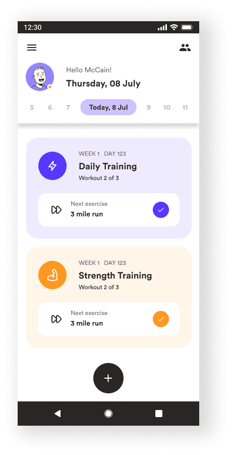
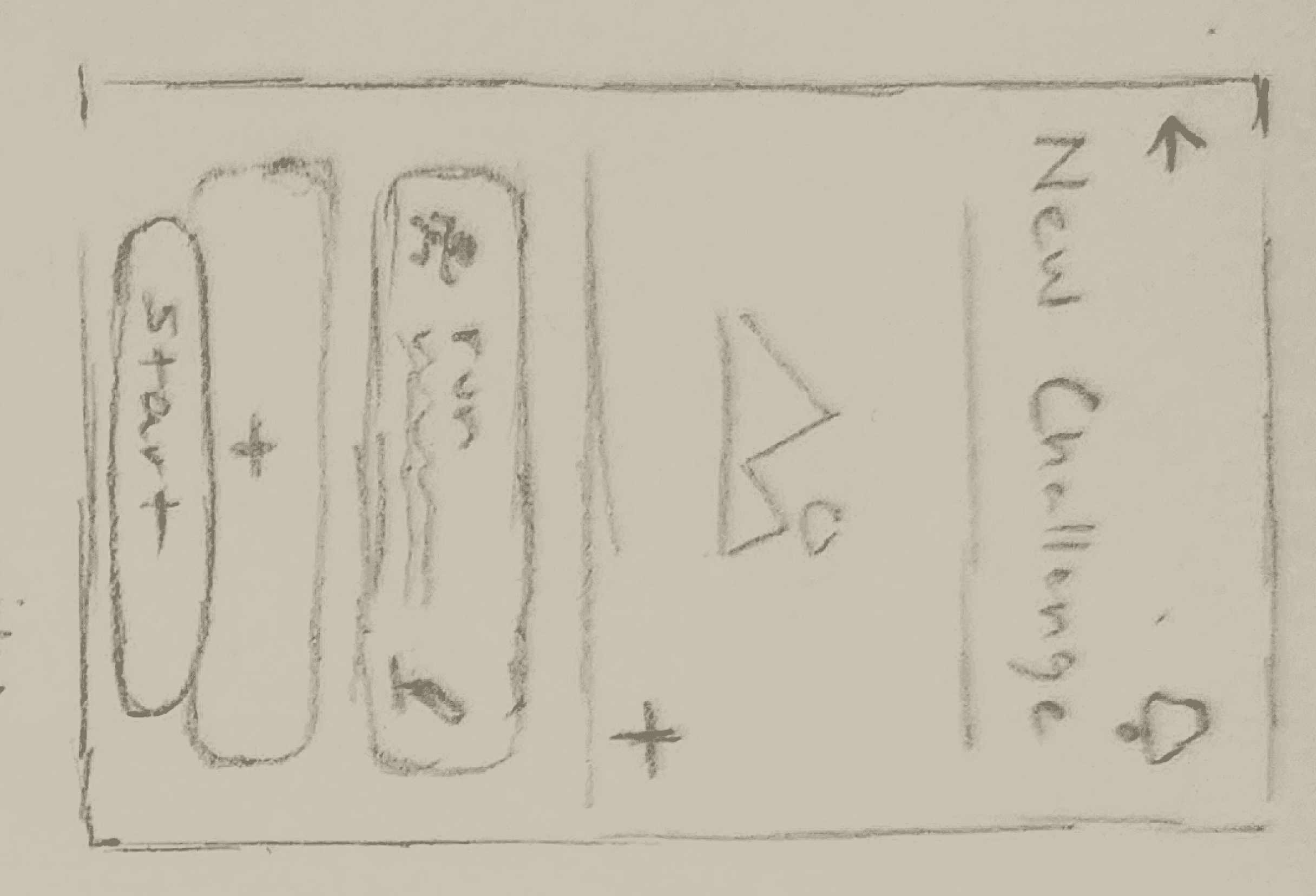
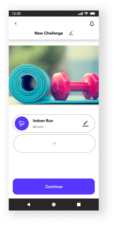
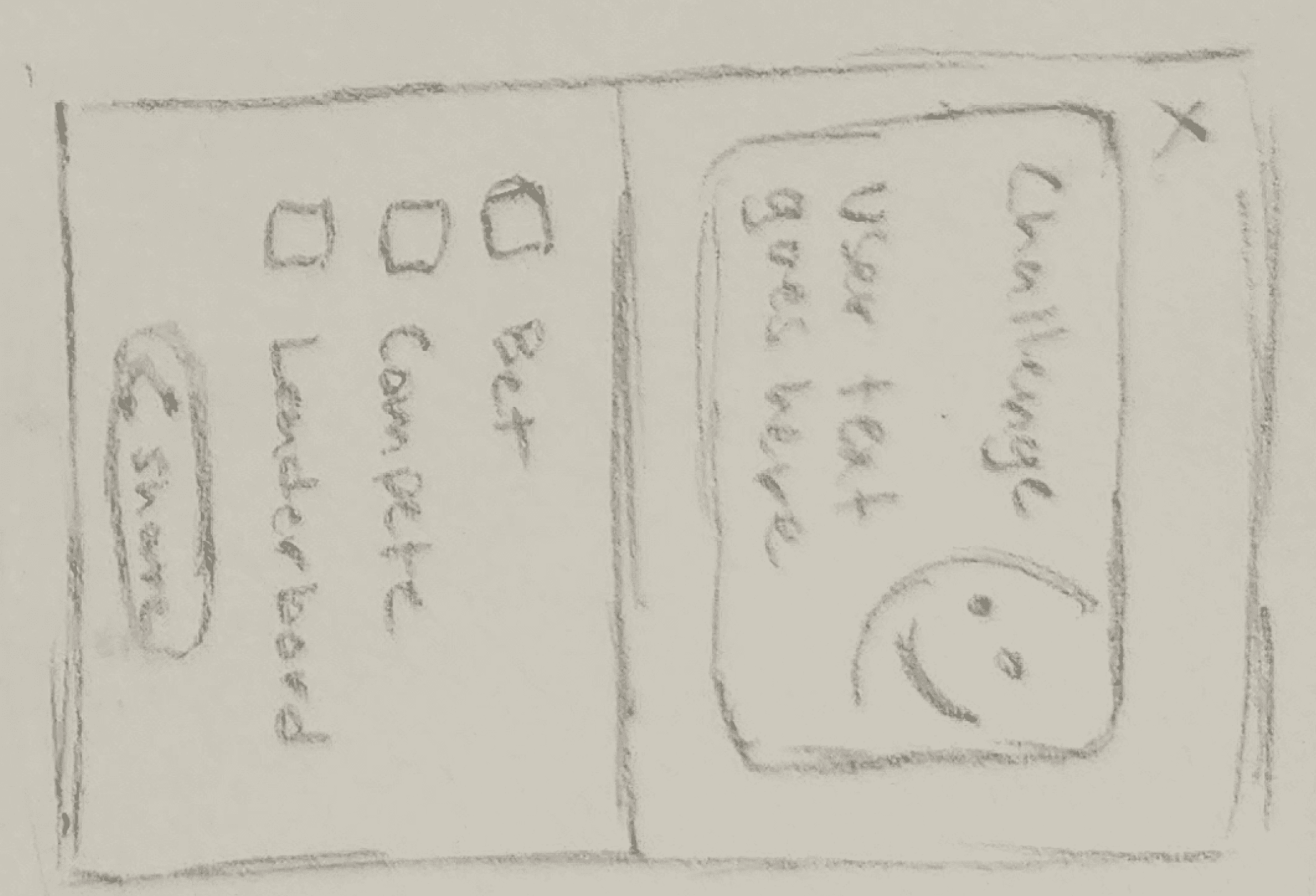
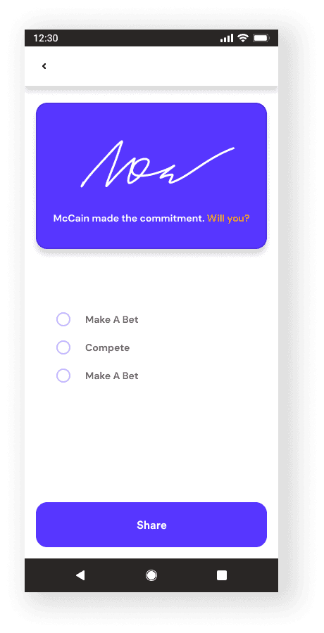
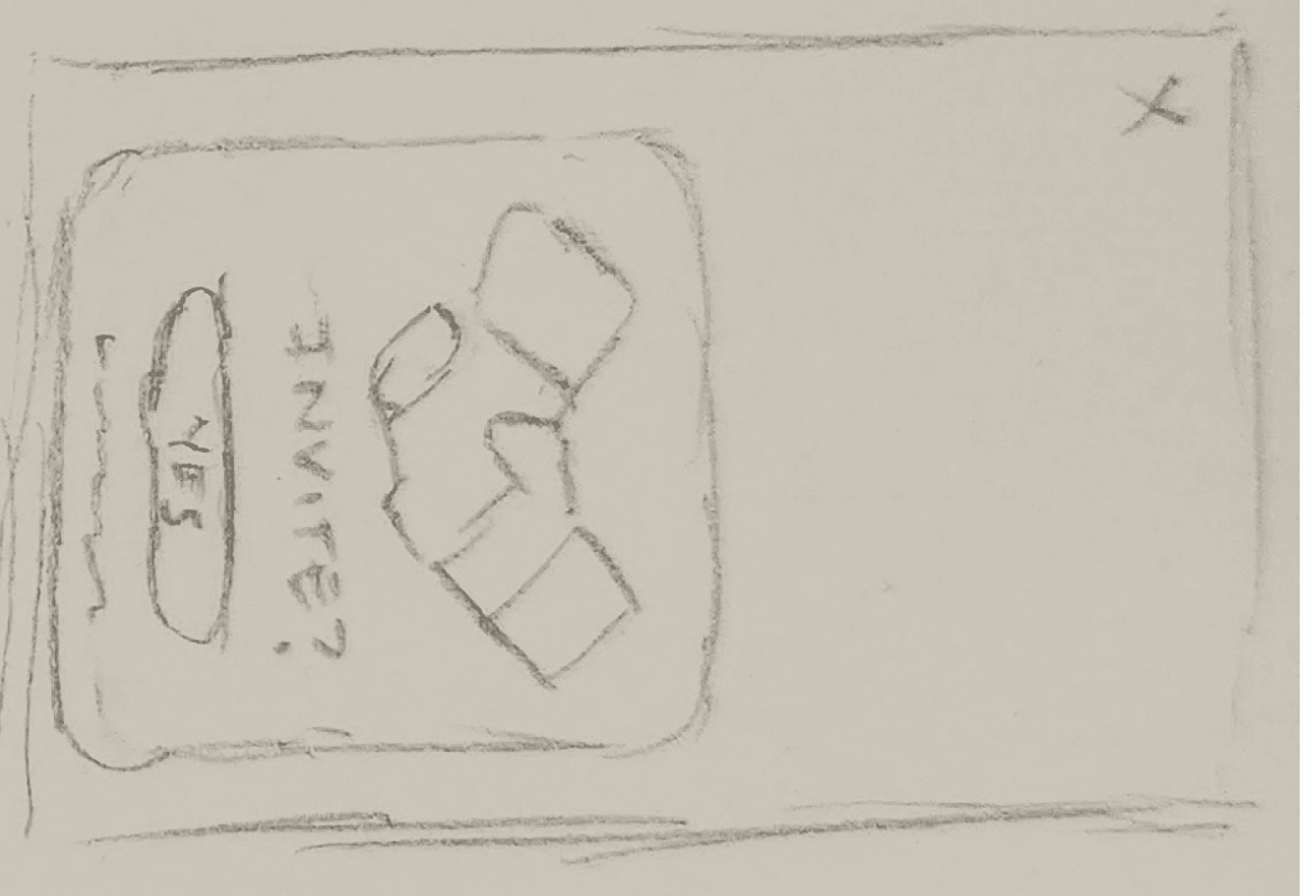
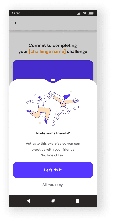
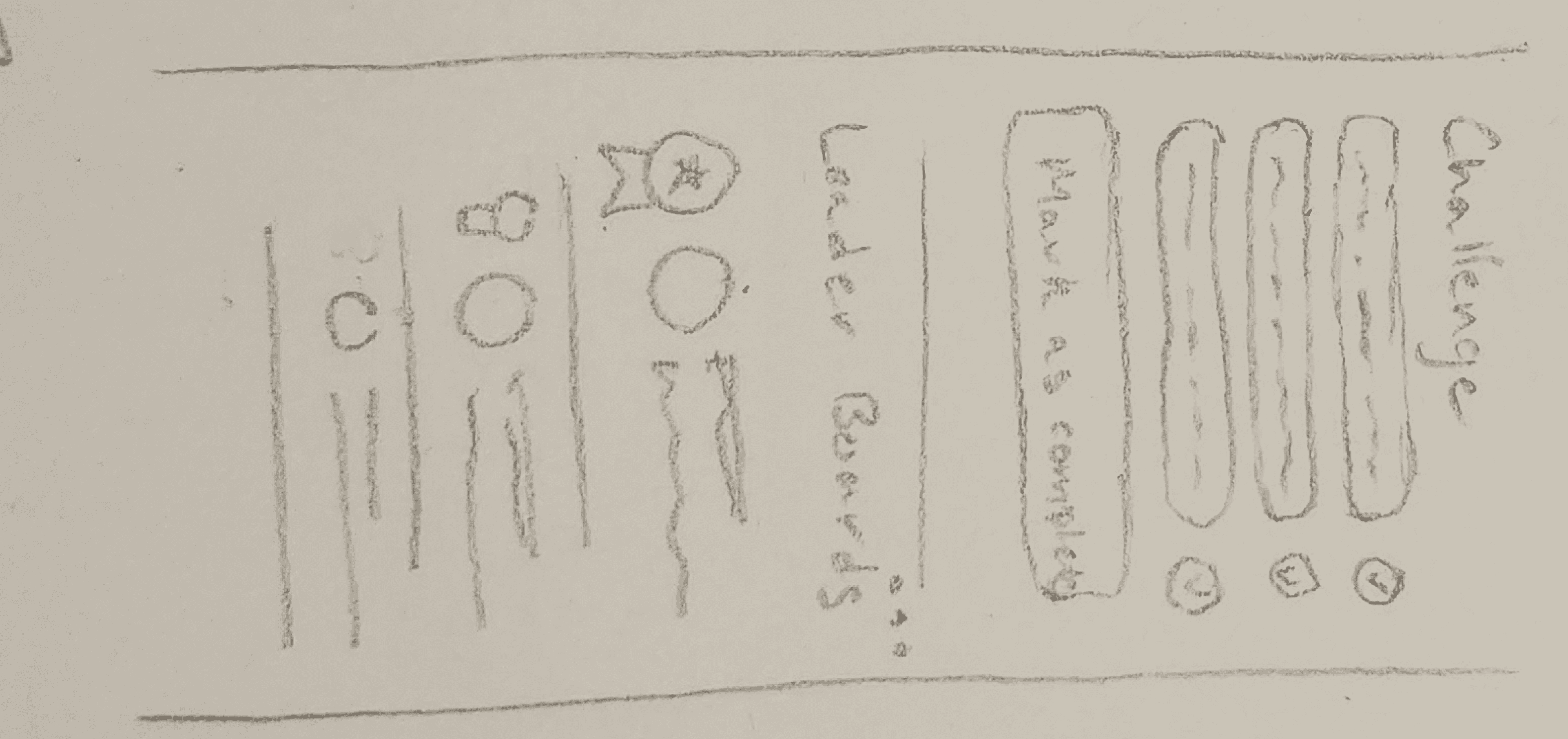

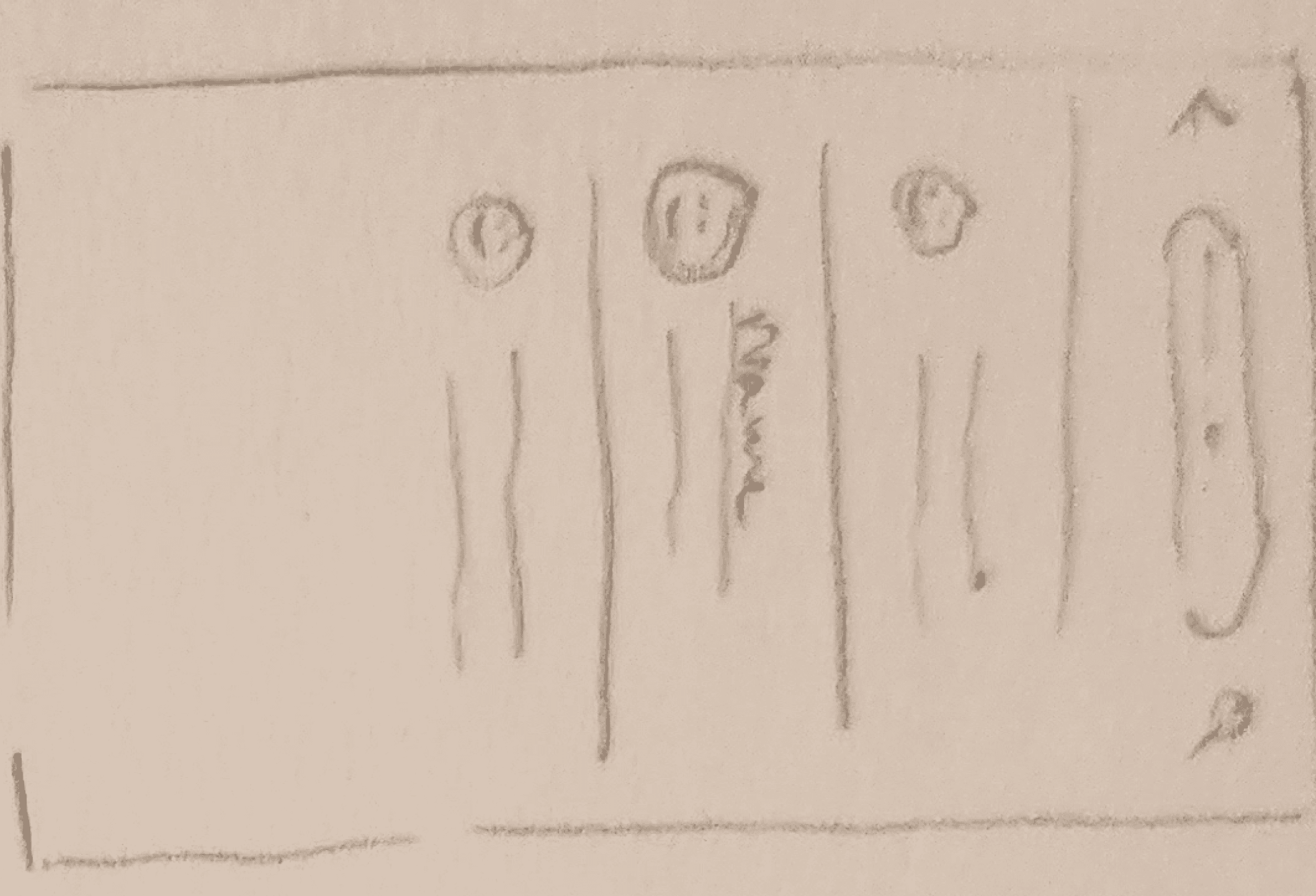

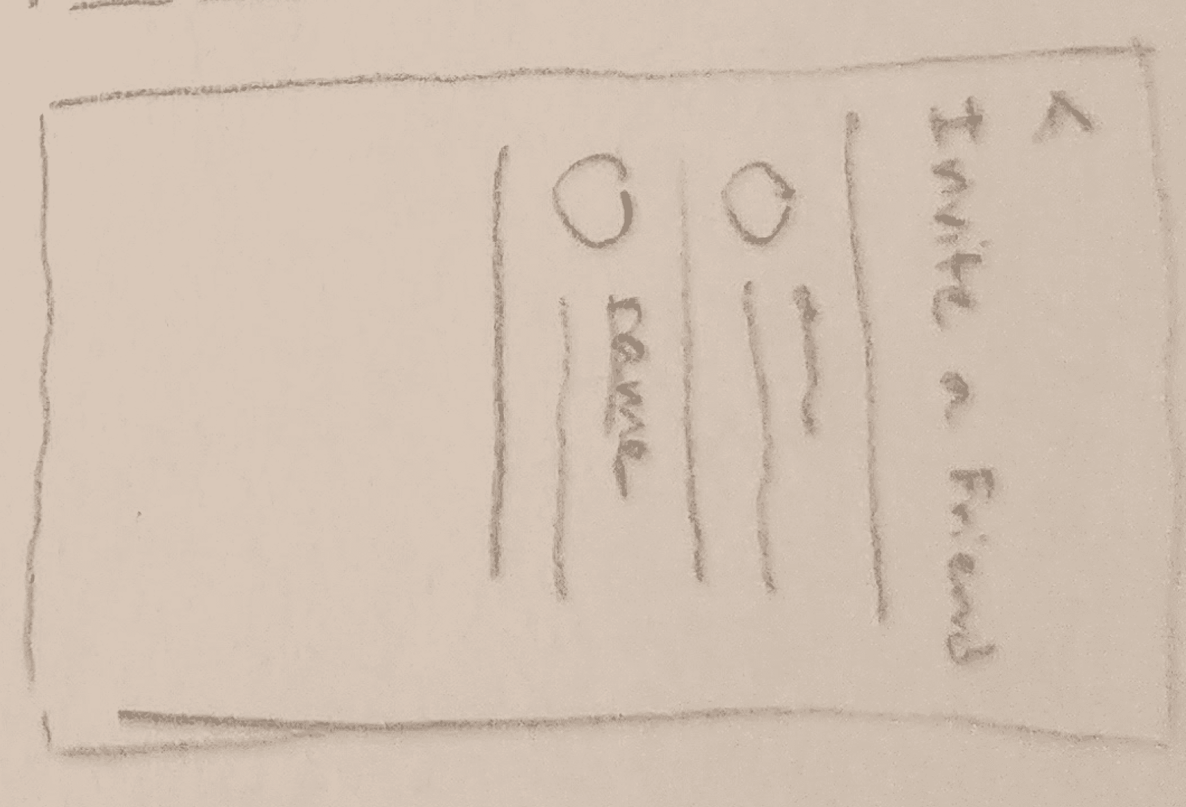
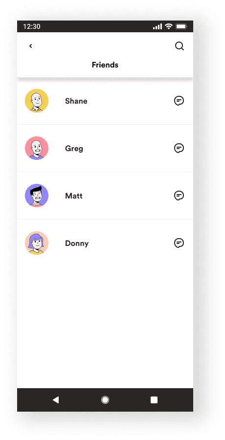
With the prototypes put together, I reached out to participants that fit my target demographic to test out the product. I generally followed the low fidelity guerilla testing routine, this time with specific participants.
I made sure to focus on the social features, such as the leaderboards and the parts built into the “create a workout” user flow.
Afterwards, I sorted through my notes, tagging any notable comments and actionable items.
I threw those items onto a list and got back to work on the most pressing issues as well as some final polish!
!!!
Make share/invite function more accessible
!!
Make leaderboard more understandable at a glance
!!
Make friends menu easier to reach
!
Add a quick-complete button to widgets
